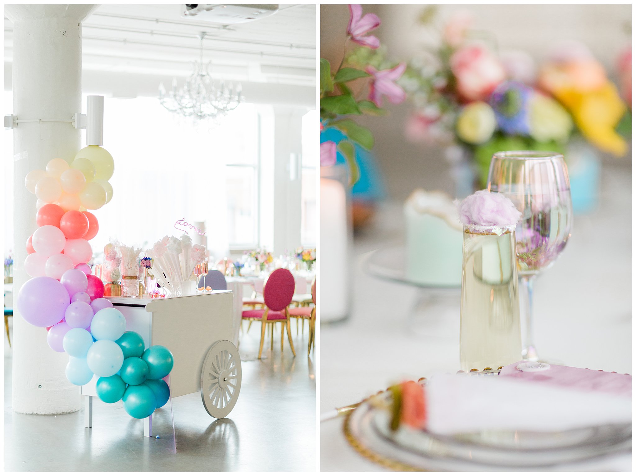
I'm a huge fan of color, I don't think that's a huge secret! But I tend to notice that brides are nervous to do too much of a pop of it. Maybe it's fear of being classic or timeless, or maybe it's just too bold. For whatever reason, the more neutral pallets tend to get the main stage in weddings.
I wanted to showcase how color can be used in a fun, poppy way without becoming tacky. Enter this shoot! I teamed up with an amazingly talented team of Chicago vendors to create this masterpiece! I've had so many people tell me it reminds them of macarons! Whatever it reminds you of, I guarantee it's something positive! Take this inspiration in mind when you are considering adding a pop of bright color to your big day!
P.S: If you can pick up on the Taylor nods, we can be friends.
Vendor Team:
Venue: www.room1520.com
Photographer: www.photographybylauryn.com
Design + Curated Decor: www.rustiqueswan.com
Invitations, Menus, Escort Cards, + Paper Rings: www.emeryanndesign.com
Florist: www.
Cakes: www.thequintessentialcake.com
Balloon Installation + Cart: www.bubblyeventschicago.com
Calligraphy + Custom Lettered Jacket: www.jessicadrapercalligraphy.
Bridal & Bridesmaid Dresses: www.dianasbridal.com
Party Dress: www.brizancouture.com
Makeup + Hair: www.lueurbeauti.com


